CI
Realizing ‘the new paradigm of treatment’
Introducing the CI of Digital Pharm
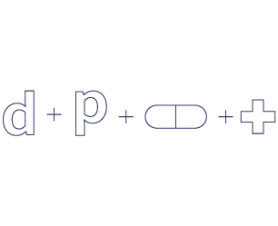
Logo mark considering the harmony of ‘digital’ and ‘therapeutics’
The logo mark was developed in consideration of the formative characteristics of ‘digital’ and ‘therapeutics’.The use of the logo mark alone has the advantage of reducing restrictions on application space and increasing readability, but it has the disadvantage of lacking symbolism to be used as a signifier representing the digital Pharm.
It is a principle to apply the basic symbol mark, but if it is impossible to reproduce the basic symbol mark due to the limitations of media characteristics or reproduction techniques, it is recommended to use a modified color logo and use a signature combination of ‘logo’ and ‘typo’.
-


Inspiration
-

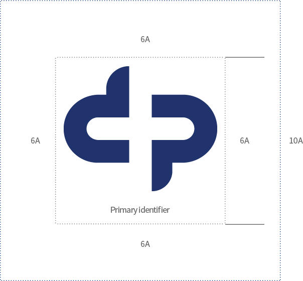
Primary identifier
-
-
DP Blue
PANTONE_648c
C96+M92+Y36+K3
R36, G52, B109
-
-

Modification A1
-

Modification A2
-

Modification A3
Digital Pharm signature combination, horizontal combination
-
Symbol highlight

-

-
Logotype highlight

-

-
Symbol highlight B

-

Digital Pharm signature combination, vertical combination
-
Symbol highlight

-

-
Logotype highlight

-

Specification on space
Clear space is the minimum protection space that must be separated from surrounding elements to secure visibility and prevent image damage when applying a symbol."Minimum size" is the minimum size that can secure visibility when using a symbol, and should not be applied in a size less than 10mm in terms of vertical (height).


Specification on colors
The colors of Digital Pharm are based on primary colors that maximize brand image and give diversity to productions.
-
DP Blue
PANTONE_648c
C96+M92+Y36+K3
R36, G52, B109 -
DP Green
PANTONE_2411c
C91+M61+Y100+K44
R1, G63, B13 -
DP White
C0+M0+Y0+K0
R255, G255, B255
-
DP Gray
PANTONE_425c
C71+M63+Y65+K17
R88, G87, B82 -
DP Light Gray
PANTONE_7534c
C24+M22+Y25+K0
R203, G196, B186
-
DP Silver
PANTONE_cool gray 5c
C39+M31+Y27+K0
R168, G169, B173 -
DP Gold
PANTONE_7562c
C31+M41+Y63+K0
R188, G155, B104
Specification on background colors
As a rule, Digital Pharm’s symbols are applied on a white background. In case when it is not possible to secure a white background, the default type is applied within 30% of the brightness of the black standard, and the white is reversed and applied to the background with a brightness higher than that.
- Primary color
- Silver Color
- Gold Color


